Speed up data exploration with ad-hoc data filters in Streamlit

I love Streamlit. It is an amazing tool, to quickly create interactive data apps. In data science, it is often beneficial to get first results early and then improve iteratively. Making data available and accessible to domain experts is an important step in that journey.
With Streamlit, it is straightforward to build custom applications. Apps can easily be tailored to specific data science projects. But with a few tricks, they can also be made more generally applicable.
In this post, I want to highlight a few techniques I used to create this dataset-agnostic data visualization app. If you are familiar with Streamlit, you may skip the introduction of the library and description of its components and jump to this section.
What is Streamlit?
Just in case you have never heard of Streamlit, here is a brief description. Streamlit is an open-source Python framework to create custom web applications. It is specifically designed for machine learning and data science, but it is in no way limited to those use cases. The underlying Python code is executed server-side, and the resulting outputs rendered to the user. Streamlit applications can be run on a local machine, or deployed to a cloud platform such as Streamlit Cloud or Heroku.
Almost no boilerplate code is required and fairly sophisticated interactive apps can be written in only a few lines of code. Here is an example, that showcases how little effort is needed to create a reasonably good-looking interface users can interact with.

We can see a heading, some explanatory text with parts highlighted in bold and italics, followed by a textbox. In this simple demo, the user is supposed to enter a name. The input is written to a final text element, but only if something was actually entered. Otherwise, a blue info box with instructions is shown.
Below is the entire code for the example app — Less than 15 lines, including a couple of empty ones. The syntax is so clean that the code almost explains itself.
|
|
There are many excellent resources out there describing the basics of how Streamlit works. A good place to start is the official documentation. TL;DR: The app is executed top to bottom. Any literal or variable given on its own line is printed to the UI. In addition, Streamlit provides many different UI elements to display and receive data. Values given through input elements (such as the textbox in the example) can be stored in Python variables and accessed later in the code.
Building an interactive data app
Through the following sections, we will build this Streamlit app from scratch, that creates a colored regression plot for user-specified variables. The underlying data can be interactively sliced into more narrow subsets, which I have found to be very useful in exploratory data analysis and discussions with domain experts. Although the app’s functionality itself is not that impressive, the underlying concept is applicable to all sorts of data apps.
Hard-coded, static baseline
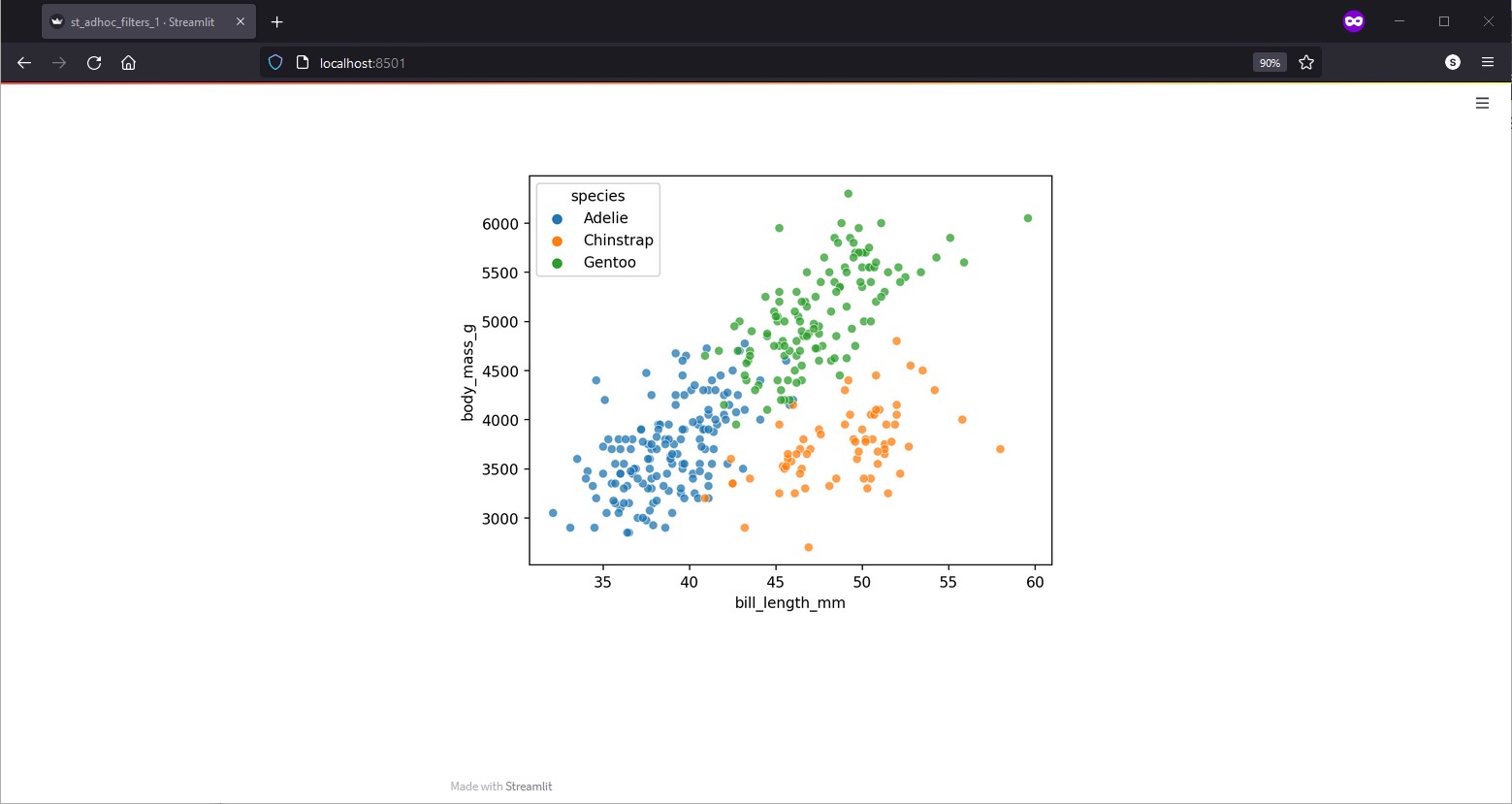
Before making the app dataset-agnostic, we are going to hard code everything. As exemplary data, I like to use the Palmer penguins dataset1. It provides various body characteristics of penguins from three different species — more info here.
Here is the code for a fairly underwhelming, static app that creates and displays a colored scatter plot inside Streamlit.
|
|
Under the hood, seaborn is used to create the plot, which was an arbitrary
choice for this example.
Streamlit supports many other plotting libraries very well.
Below is the corresponding app. It’s really unexciting, but we are going
to build upon it to create a powerful tool for EDA.
Improving the regression plot
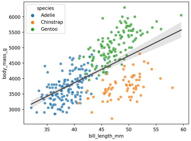
Briefly, I want to extend the plot itself to also show a regression line and
choose a different color palette for numerical data.
For this, the plotting code is wrapped inside a plot_regression function:
|
|
Again, this is just an example. The plot could be improved in many ways, but we want to focus on the Streamlit setup. The plot below shows the improved regression plot. It highlights that there may be a need to consider different subgroups in the data.
User-selected plot variables
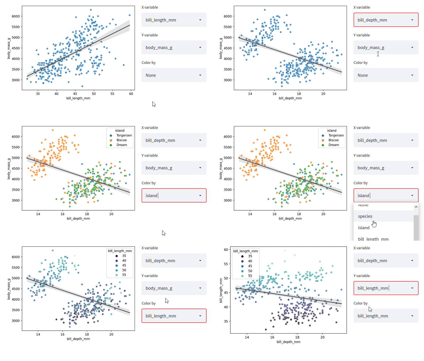
We can start to enable user interaction by making the X, Y and hue column
selectable.
All we need is a couple of st.selectbox elements.
X and Y should be numeric columns, hue can be either numeric or categorical.
Because the app should work with any dataset, we need to first make sure
that there are some numeric columns to display.
|
|
If there are no numeric columns, we warn the user and stop the execution.
st.stop() in Streamlit, much like return in a regular function, stops
the execution early without raising an error.
Having a list of numeric columns as a separate variable avoids code duplication
in the creation of the X and Y selection boxes.
At this point, I want to introduce a two-column layout, that features the plot on the left and variable options on the right. Streamlit makes this easy. The following code creates 2 columns, where the first is twice as wide as the second one.
|
|
We can now use the leftcol and rightcol as context managers to add UI
elements to each column.
In the code, the right column needs to be filled first, as the plot on the
left relies upon user input gathered here.
|
|
The selection boxes for X and Y are straightforward.
By default, the first numeric column in data is chosen as X (implicitly)
and the last numeric column as Y, which is often a reasonable choice (😉).
Because the st.selectbox does not allow empty selections, a small trick is
needed to make coloring optional.
The hack is inspired by comments from
this discussion.
We manually add a "None" option to the list and later replace it with Python’s
actual None to indicate an empty selection.
With X, Y and hue selected by the user, we can create the regression plot and display it on the left:
|
|
And this is what we get:
Loading any dataset
By now, the code for the app does not reference any variable names and could
therefore be used with any
tidy dataset.
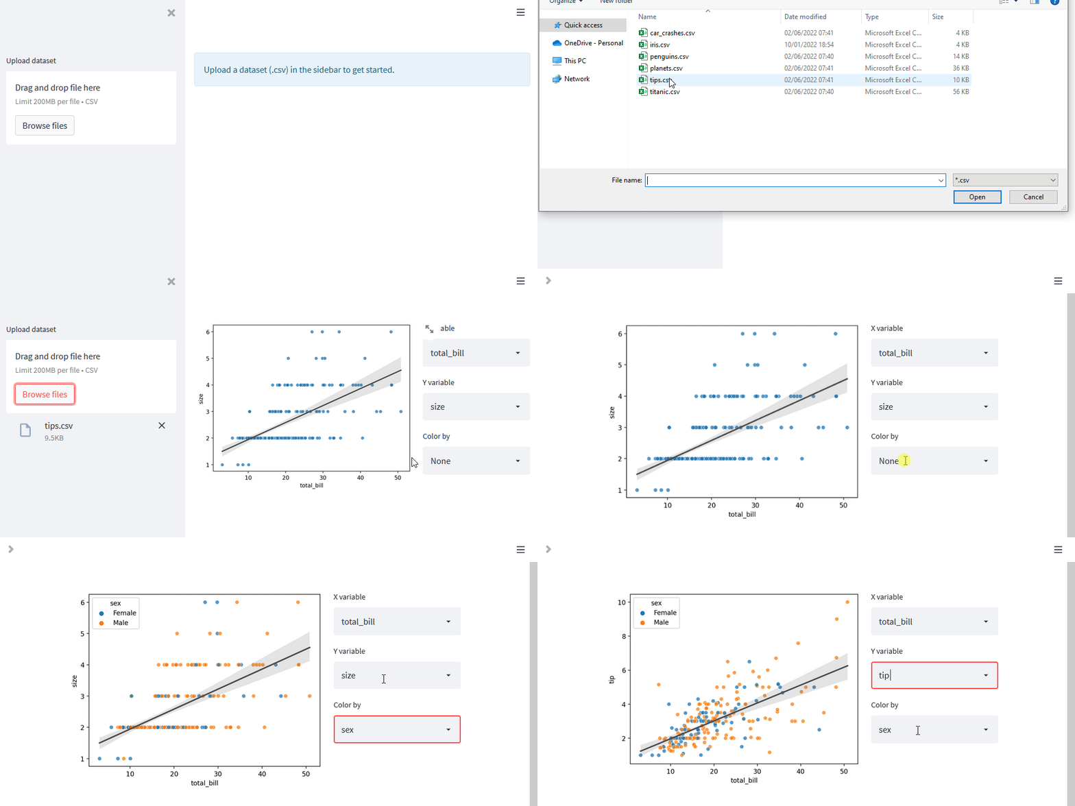
Streamlit provides the st.file_uploader widget,
which allows the user to provide the app with any data they choose.
Let’s replace loading the penguins data with a file_uploader.
It is good practice in Streamlit, to use caching for potentially resource
intensive or time consuming tasks.
We create a read_data function and decorate it with
st.cache.
For this demo, only CSV files are allowed, but read_data could easily be
extended to allow other file types like Excel or Feather.
|
|
With caching, a copy of the data frame is stored in memory and accessed upon re-execution. This improves performance considerably, as the CSV content does not need to parsed with every user-interaction.
In the app, we can add the file_uploader to the sidebar, so that it does
not clutter the main area.
As long as no data is given, a message is shown to the user and the execution
stopped.
|
|
Note that the file uploader is explicitly limited to only accept CSV files. Also note that after reading the cached data, the data frame is immediately copied again. This is important in the next step, when filters are applied to the data, which would mutate the cached object.
Now, any CSV dataset can be uploaded and processed by the app:
Ad-hoc data filters
The regression analysis for the penguins dataset is overshadowed by clear groupings in the data. Depending on the goal, it might make sense to investigate different subpopulations individually. So we need interactive elements that allow the user to subset the data on the fly. Again, this is quite straightforward to do in Streamlit and we can even make the filter setup dataset-agnostic.
Adding categorical filters on the fly
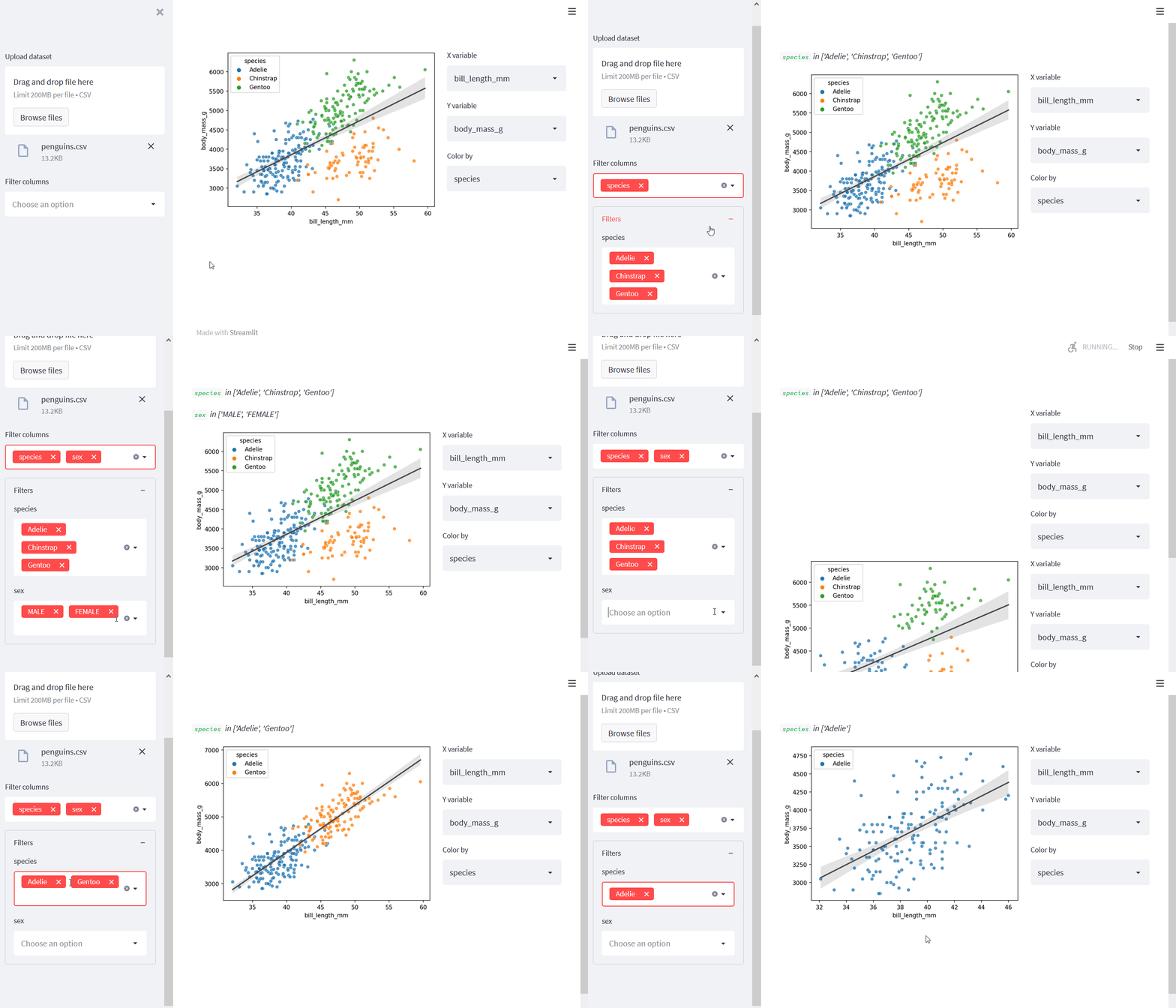
Before showing my final implementation of this app, I want to highlight the approach taken by only considering the categorical columns. First, we add a selection box to the sidebar, that allows the user to “promote” specific columns to filter columns. For now, we exclude numbers and datetimes, as they will require different UI elements.
|
|
For each promoted column, we can now create a new
st.multiselect element, that allows the user to
select or deselect specific categories in the dataset.
The selections are stored for later use in a dictionary, with column names
as keys and selections as values.
|
|
All of this is done inside an st.expander, which visually sets the filters
apart from the rest of the sidebar.
Note that empty selections are not included in the dictionary here.
They would lead to an empty data frame, which is quite useless for our data
app.
We could choose to filter the data already within the for-loop above. However, this leads to a behavior, where the selection on the first filter influences the options available for a second filter - and vice versa. I have found this to be very unintuitive and also not very user-friendly, because once options change for a Streamlit input element, it is reset to the default value.
Instead, the data is filtered in a separate step.
We can leverage pandas' query method:
|
|
Here is the code and a screen capture of the app so far. Only 64 lines already achieve quite a lot.
|
|
Data slicers for all data types
I have found categorical filters most useful during EDA of my projects, but there is no need to limit ourselves to categorical variables. We can create two-sided select slicers for numeric and even datetime types. Let’s create a function that takes a column name and creates the corresponding Streamlit element.
|
|
With this, the code for creating the filter UI elements becomes a bit more readable:
|
|
Finally, we need to apply the user’s slicer selections on the dataset. Depending on the column’s data type, the filter syntax is slightly different, which is best addressed in a separate function.
|
|
If the column is either numeric or a datetime, we can use the Python’s concise comparison notation. If it is any other data type, we can assume the selection is a list of included values. Applying this function is almost trivial:
|
|
Below is the entire code so far. It is not that much different from the final data app.
|
|
Bonus: Catch-all text query
Just in case the interactive slicers are not sufficient, we can add a final trick to allow any filters the user can imagine. We can achieve this by exposing the pandas query function directly to the user through a text input. Then, the user can enter any valid query string to perform a custom data selection.
All we need is two additional lines:
|
|
Note that an empty query is replaced by "tuple()" which selects all rows in
the data frame (more details here).
Alternatively, we could also check for an empty string and simply not execute
the query.
Final Streamlit EDA app with ad-hoc data filters
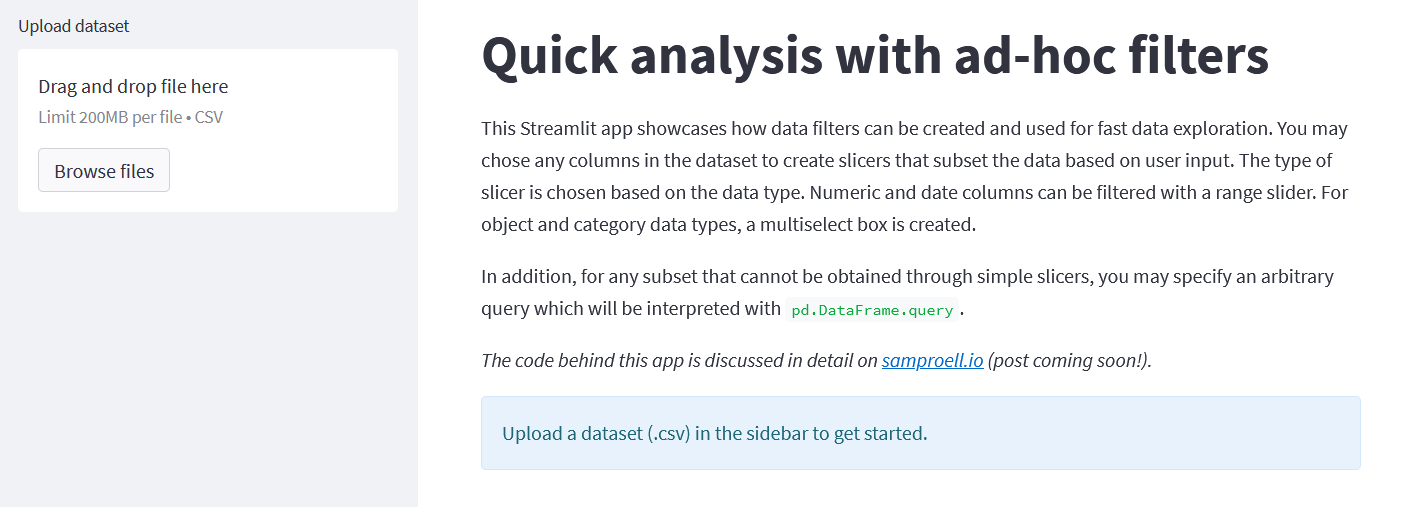
With the bonus above, we have re-created the complete app I introduced at the top of this post. You can access the app here and you are welcome to build upon the code behind the app.
Conclusion
Of course, the app is fairly limited in it’s functionality, but I personally still think it is quite impressive for less than 140 lines of code (including some comments and descriptive text elements). The intuitive and clean syntax of Streamlit makes it incredibly easy, to create interactive data apps. In mere hours, a data scientist can create a functioning prototype and thus quickly generate value for stakeholders.
One could easily extend and improve the app in various ways. For example, you could use Plotly instead of seaborn, to make the charts themselves interactive. You could also add box/violin plots for categorical X/Y variables, or choose a different data visualization all together. This app is 100% dataset-agnostic and only requires a CSV file in standard tidy format — other file types could be implemented as well. For other use cases it might make more sense to tailor the app to a specific dataset and/or to connect to a data source directly.
Finally, hosting the app is really easy with Streamlit Cloud, which works directly from GitHub and is free for public repositories. There are other options to deploy the app as well, such as Heroku. In many cases however, it may already be enough to spin up the app on your local machine while working through the data alone or together with domain experts.
(References)
-
K.B. Gorman, T.D. Williams and W. R. Fraser, “Ecological sexual dimorphism and environmental variability within a community of Antarctic penguins (genus Pygoscelis),” PLoS ONE, vol. 9, no. 3, p. e90081, 2014, doi:10.1371/journal.pone.0090081 ↩︎